


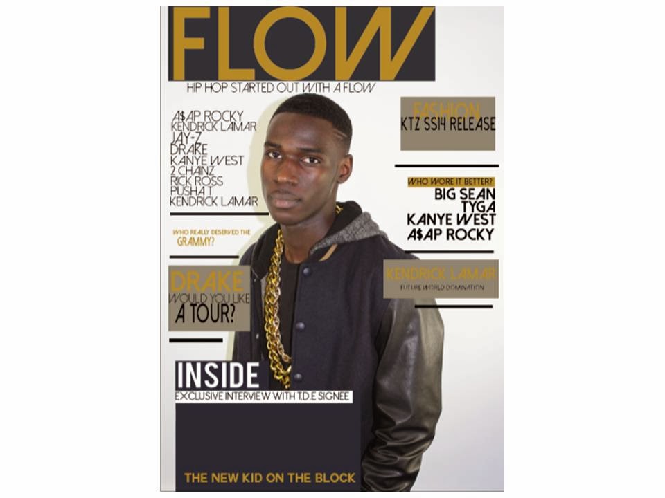


Above you can see the transition that has taken place for me to arrive at what is my final cover .I started off with a plain white background and then added my chosen image onto a second layer called 'image'. I then added the boxes behind each position I wanted each piece of text to be places and changed the colours as a way to test what colour schemes would work best for the magazine and the image used.
I finally decided that grey and navy were best due to the image's background and the model's jacket; I used the ‘eye drop tool’ to get these colours. With the background boxes that were to be set behind the text and also the Masthead. I added my masthead; originally on my flatplan it was going to be red however I decided that gold would be the best colour to use due to the bright colour of the models’ chain. I used the ‘eye drop tool’ again.
I started creating my features on the front cover afterwards making sure everything was aligned, here is where I began to include names of artists that were related to my genre to allow readers to get a greater understand of my target audience. For this text I went to dafont.com and used ‘Dolce Vita’.
Bit by bit I added more features ensuring I added colour to the text in the features section that I needed the readers to pay most attention to and also to make the cover more exciting.
After completing my features on both sides, I added the tagline below the masthead to give the magazine an extra flavour and make it clearer as to what genre it was specific too, also to make the magazine seem more like a real one.
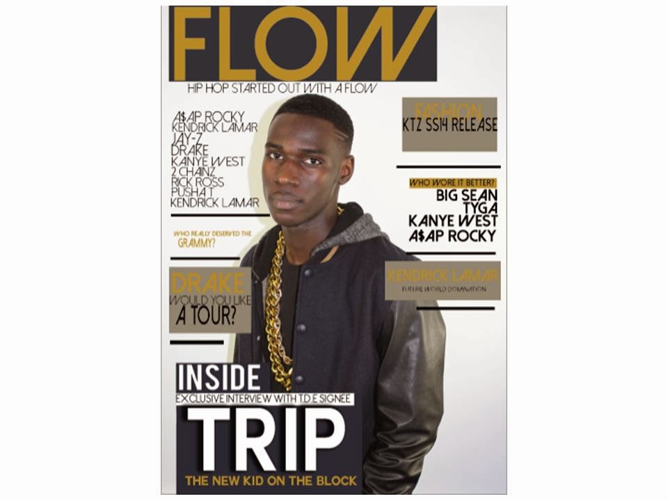
I started work on the area where I was going to place my main artists name and also the necessary titles and text around his name to attract my readers. I made sure to emboss the text so that the name stands out more.
Other than the masthead being the biggest thing on the front cover I ensured that my artists’ name was also large but instead of gold I made it white. This ensured it was prominent and stood out from the other text.
I then added a tag line underneath the artists name to let readers know what my artists’ role is in the industry and that they are new. I then added on a barcode, this added a sense of reality to the magazine and I then added on an issue date and price as well.
No comments:
Post a Comment