Friday 28 February 2014

30. FRONT COVER TARGET AUDIENCE FEEDBACK

Aisha – I love the colour scheme, because it looks very fresh and modern. The font it unique and effective this automatically draws me in.

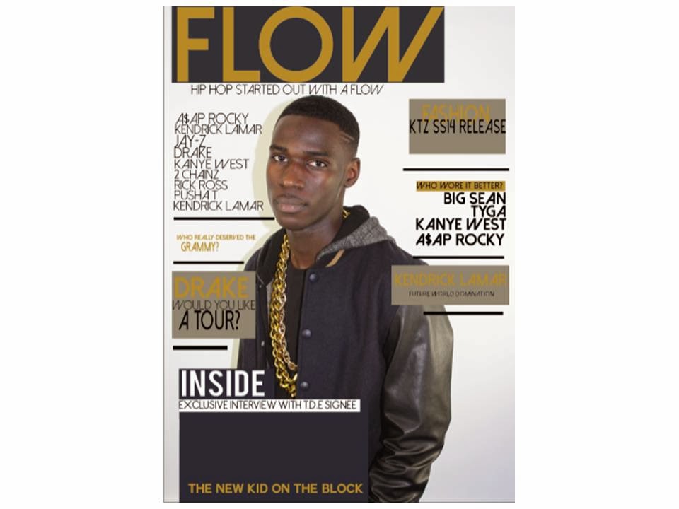
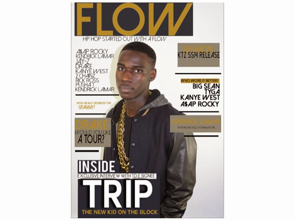
Heleni – I like the main image it attracts me to want to buy the magazine, I like the colour scheme and the masthead looks very current. I like the range of fonts used. However there is no price or date of issue. The sub-heading however is very interesting.

Sabrina – I like the obvious link with your artists clothing and the colour scheme, your font works very well with your genre. Grey box behind text makes it bolder and more effective. You’ve laid out features equally, and the pale white background encourages a good contrast between it and text, this makes the text more visible.

Cherise – I like the colour scheme as it goes well with the genre, it looks very professionally put together.

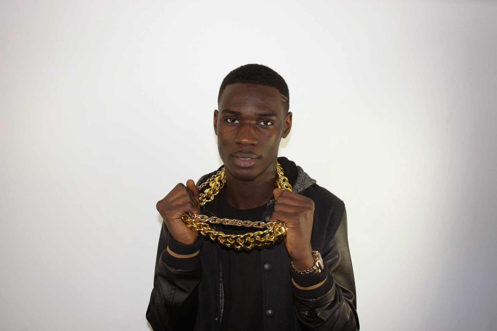
Precious – You need to include issue number and date 
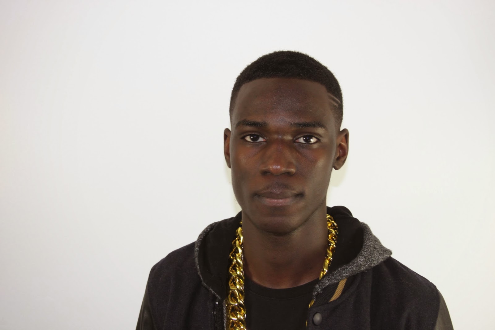
along, it also conforms to all the conventions of a Hip-Hop magazine. Mis-en-scene of the cover artist conforms well, as chain clearly represents what the genre puts forward “arrogance, and pride” along with this the blank expression. The features artists are appropriate, and I love the punchy tagline and easy to read.

Jhineil -  I think it looks very profession, I love the colour scheme. I think it could be improved by moving the issue to where the masthead is. I think the masthead could be bigger and potentially  be embossed.

29. FRONT COVER LINKED TO RESEARCH

From the research results that I got, I have gone with the preferred colour scheme however have improved it as well. The colours I decided on were black, navy, grey, white and gold. My target audience requested ‘simple and plain’ colours however I added in the gold as well as it ties in with the genre.

From the research results, most people said their favourite genre of music was Hip-Hop. When i first started my magazine I wanted to try do a Hip- R&B magazine which is where I would've incorporated the Hip-Hop genre and R&B genre together but pretty early on I decided to just make a Hip-Hop genre magazine. I feel as though the front cover shows evidence that the genre is Hip-Hop. The gold jewellery represent what a typical Hip-Hop artist would wear. I took the colour from the chain and put that on my masthead. The colour gold represents wealth, success, achievement and triumph. These are all representative of who she is, achieving success and triumphing despite struggles she has faced. Along with that my artist has a very blank facial expression, this represents a sense of arrogance and assertiveness all thing that within this genre are represented.

A question that I asked in my questionnaire was 'what would most attract you to a music magazine cover'. Most of the target audience answered the artist on the front cover, I made sure my artist was doing angle of gaze so that it felt as if she was engaging with readers.I refrained from chaging anything on the artists face just because i felt it would not have been an honest representation of them if I had done so. With this I believe I could reach a wider audience because of the honesty of my artists’ depiction.
My price range was clear due to the question I asked my target audience on how much they will be willing to spend on my magazine, I set it at a higher price between the £1-2 bracket because I believe my magazine is of a higher quality.

28. STEP BY STEP PRODUCTION


Above you can see the transition that has taken place for me to arrive at what is my final cover .I started off with a plain white background and then added my chosen image onto a second layer called 'image'. I then added the boxes behind each position I wanted each piece of text to be places and changed the colours as a way to test what colour schemes would work best for the magazine and the image used. 

I finally decided that grey and navy were best due to the image's background and the model's jacket; I used the ‘eye drop tool’ to get these colours. With the background boxes that were to be set behind the text and also the Masthead. I added my masthead; originally on my flatplan it was going to be red however I decided that gold would be the best colour to use due to the bright colour of the models’ chain. I used the ‘eye drop tool’ again.

 I started creating my features on the front cover afterwards making sure everything was aligned, here is where I began to include names of artists that were related to my genre to allow readers to get a greater understand of my target audience. For this text I went to dafont.com and used ‘Dolce Vita’.

 Bit by bit I added more features ensuring I added colour to the text in the features section that I needed the readers to pay most attention to and also to make the cover more exciting.

 After completing my features on both sides, I added the tagline below the masthead to give the magazine an extra flavour and make it clearer as to what genre it was specific too, also to make the magazine seem more like a real one. 

I started work on the area where I was going to place my main artists name and also the necessary titles and text around his name to attract my readers. I made sure to emboss the text so that the name stands out more. 

Other than the masthead being the biggest thing on the front cover I ensured that my artists’ name was also large but instead of gold I made it white. This ensured it was prominent and stood out from the other text.

 I then added a tag line underneath the artists name to let readers know what my artists’ role is in the industry and that they are new. I then added on a barcode, this added a sense of reality to the magazine and I then added on an issue date and price as well.

27. FINAL FRONT COVER

This is my final front cover. I created this using Photoshop and included all elements that a professional magazine would include: masthead, pull quote, tagline graphics, bar code, price and sale lines. Looking back at the steps that I have taken to create this music magazine, I can see how I've made the right decision to change the colour scheme, and less features that I had planned due to the fact that they were not genre appropriate or appropriate for my target audience.

Getting rid of my features referencing ‘female pop and r&b artists’ helped my music magazine front cover stand out as the features are things that would interest my target audience. I prefer the navy, lack, grey, gold and whit colour scheme to my original one which was based off of a XXL cover. Everything links in with my artist so it's easy to see where the colour scheme comes from.

I originally wanted to incorporate both Hip-Hop and R&B into the magazine as there are not any which do this to a high standard. I changed my idea to it being just a Hip-Hop magazine; I found it was easier to find other magazines which I could compare it to and because of my love for the genre would be able to produce something of a very high standard.

I am pleased with how my front cover turned out. How the front cover looks is different to how I thought it would look. I took inspiration from XXL magazine which I feel is shown in my music magazine. The layout of the rest of my magazine will be based on this magazine also.

Thursday 27 February 2014

26. PHOTOGRAPH MANIPULATION

I decided to manipulate the photo by changing the brightness and contrast, other that I refrained from smoothing the skin, or removing any creases in the clothes because the genre itself is extremely raw and edgy it would have been very unnatural to do so. 

My model does have very spotty skin, however this shows his age and is a very honest depiction of my artist. Instead of making him look too false, I preferred the more natural look so decided to stick with it.


(here is the picture un-edited)


(here is the picture edited)

Wednesday 26 February 2014

25. FEATURES ON A FRONT COVER

These are my chosen features that were developed off of my original idea on my flat plan, I decided to include these as they relate strongly to my magazine genre by including artists from this particular genre. These features will also appeal to those that are fans of this genre because of each artists' likability and amount of celebrity. My focus group members all agreed that they are more likely to pick up a magazine with an artist that they know, or like on the front. However as my brief would not allow me to create a magazine with an artist in the public eye I thought that referencing many of the top artists at the moment in feature form would be a good idea to attract their fans, Kanye West etc are well known artists from this genre. My original flat plan ides for my features included artists like 'Beyonce' and 'Rihanna', however these artists suit best on a pop/r&b magazine due to their style of music and the target audience they appeal to. My magazine is a combination between a Hip-Hop and fashion magazine, therefore I realized that my target audience may not understand as to why they are present. 

The First feature has a list of the most famous artist at the moment, 'A$AP ROCKY, KENDRICK LAMAR, JAY-Z, DRAKE, KANYE WEST, 2 CHAINZ, RICK ROSS, PUSHA T' this makes it very clear to any reader that the genre of this magazine is Hip-Hop. 

Feature two is connected to the feature above because all of the artist above were up for Grammy awards this year, or should have been nominated in this article I will be talking about 'who really deserved the Grammy' according to members of the public because this is a music magazine, and of the Hip-Hop genre music awards shows relate to the magazine, but along with that the genre of each artist is specific to this magazine as they are Hip-Hop artists. 

Below that feature is an exclusive interview with Drake, who is currently on tour and the name of his tour being 'Would you like a tour' let's readers know that this article may be about his tour, a lot of Hip-Hop fans go to concerts of artists like Drake and furthermore he will be making his tour accessible to UK fans very soon, there for this article will appeal to those who want to know what to expect from this tour.

Across from this feature I have included a unconventional feature, this advertises the SS14 release of KTZ, which is a fashion brand infamously worn by many members of the Hip-Hop community e.g kanye West, Wiz Khalifa, A$AP Rocky etc. This may also introduce fans of the genre to this company but also it is in close relation to the genre on this magazine. fashion is strongly related to the Hip-Hop genre because of the amount of artists that go into fashion and also keep up with the current trends. Those in my target group will be interested in this feature because the age range is very impressionable and very influenced by fashion.

The feature below is also connected to fashion in regards to the Hip-Hop industry and genre, many artists battle for well-dressed in the Hip-Hop world and as it links well to the feature above, I thought it'd be a good idea to include.

The last feature on the magazine's right column is 'Kendrick Lamar, future world domination', I needed to have a feature that would appeal to those that did/didn't like the genre and by including a very well-rounded artists I managed to do so. Kendrick is an artist that crosses genres therefore he would appeal to all, this is the reason why I chose to attach the quote 'FUTURE WORLD DOMINATION' as he is an amazing artist from the Hip-Hop genre that manages to appeal to a large audience.

I chose to ensure that the most important parts of the features were made larger in size to encourage the reader to pay the most attention to these in particular. Some of the text is gold or black, I did this just to allow the text to appear to come of the page and grab the readers attention which is always very important when aiming to appeal to consumers. there is a gold box/background behind certain features depending on the features positioning as a way for them to be visually more appealing that the regular feature on the plain white background. This when would allow the shadow on the main image to be less apparent because of the use of grey which goes well with my colour scheme of black, navy, gold.


24. MASTHEAD/FONT DECISIONS

These are the different font sizes I had to choose out of when deciding on what size would be best for my masthead. I had already decided that 'Dolce Vita' would be best for the image i wanted for my masthead.The first two I felt looked too thin for the look i was going for, i felt the thickness of the text really made a huge difference to how effective the masthead would be and I didn't want my masthead to cause the effect of my magazine to fail. I felt some of the other fonts would be too much for the masthead as I wanted the artist to be the main attraction on the front cover. I chose a masthead text that reminded me slightly of 'XXL' however was very differen as I didn't want it to be a dead stamp of the magazine. The colour scheme and masthead is very different from that red colour that is used on the original XXL masthead. Instead i chose to use a gold because of the use of gold in the models' chain, I thought it would be a great effect.My masthead position has not changed from what I originally wanted it to be, as I  wanted most focus to direct to the artist but after playing around with the image and masthead.Below are the steps I took to finally get myself to the design I was happiest with , using a gold from the models' chain as the colour for the masthead. i chose to use a navy colour on the box behind the masthead just to elevate it off the page - therefore I chose not to use a drop shadow on the text because of the contrast of the two colours. This was a great idea because of the attention it demands from the reader but it does not over shadow the models image at all.Originally I was going to have a plain white text, and a red background box, to aid contrast of the text, because in my moodboard I realised that there was a large amount of red used in these magazine but something unconventional is sometimes more interesting.


Monday 24 February 2014

23. SHOTS TAKEN/MIS-EN-SCENE


The mis-en-scene in these photos are very clear conventions of the genre specific magazine. The most obvious mis-en-scene example has to be the use of the three gold chains around my model's neck. Above you can see there is a range of images that may be chosen for the front cover of my magazine, I focused on including the stereotypical conventions of a rapper, with a little twist due to the models style and taste in clothes. However the models taste in clothes, works well with my magazine cover because of the urban vibe I wanted to give off, originally I wanted him in all black but with the navy accents on his jacket, it gave me a potentially well ranged colour scheme which I originally did not have before taking the images. Originally the use of jewelry was not as important in my test shots, however I realized for my  cover and to aid readers to recognize the genre i would need to include a chain, and maybe of a larger size too - it was a bonus that I could find three very thick ones. Due to my magazines light urban influence I based my artists' style loosely on both Big Sean and A$AP Rocky, however the term 'lightly' does apply here due to what the model owned in his closet but I do still think that the outfit suits my genre, the chains basically save this from looking like a regular magazine that is not gender specific.